Chat colour specimen
- emerald confirmed
- gold earned
- amber decision
Status is always named in words as well as colour.
Real components, real tokens, shared with the app. All example numbers and states on this page are specimens.
component · Container width="wide" · Heading · Text · CredentialLabel
Emerald means money and action. The gradient means brand. Gold means earned. Purple is the creator accent.
The content stays light. Dark bands frame navigation, heroes, footers and product specimens. Use the dark surface ladder inside those bands.
Labels carry meaning alongside colour. Keep body text at AA contrast and respect reduced motion.
Choose a semantic role before choosing a colour. Swatch labels stay on the light ground for readability.
ColorPrimary
#067a53
ColorEmeraldDeep
#067a53
ColorEmerald
#0e6e4a
ColorEmeraldOnDark
#22b284
ColorPurple
#7918ee
ColorPurpleOnDark
#a56bff
GradientFrom
#f9969d
GradientTo
#7918ee
ColorSurfaceCanvas
#04011c
ColorSurfaceSidebar
#231c54
ColorSurfaceCard
#231c54
ColorSurfaceElevated
#231c54
ColorBorderDefault
#393362
ColorBorderEmphasis
#645d9a
ColorTextPrimary
#ffffff
ColorTextSecondary
#bcbacb
ColorTextMuted
#918cb8
ColorSurfaceCanvasLight
#fbfbfd
ColorSurfaceSidebarLight
#f4f5f8
ColorSurfaceCardLight
#ffffff
ColorSurfaceElevatedLight
#ffffff
ColorBorderHairlineLight
#e3e5eb
ColorBorderStrongLight
#c4c8d2
ColorInkPrimaryLight
#181b25
ColorInkSecondaryLight
#4b5263
ColorInkMutedLight
#62697a
ColorGold
#b8862f
ColorGoldStrong
#a87c0a
ColorGoldOnDark
#e8b547
ColorGoldInk
#7a5a1a
--gradient-accent · GradientFrom · GradientTo
CHAT_CARD_COLOR_TREATMENTS.emerald_confirmed.edge
#045d43
CHAT_CARD_COLOR_TREATMENTS.gold_earned.edge
#b8862f
CHAT_CARD_COLOR_TREATMENTS.amber_decision.edge
#646464
CHAT_CARD_COLOR_TREATMENTS.blue_info.edge
#646464
CHAT_CARD_COLOR_TREATMENTS.red_negative.edge
#b03050
CHAT_CARD_COLOR_TREATMENTS.grey_closed.edge
#c4c8d2
Poppins carries display and navigation. DM Sans carries readable body copy.
Build
component · Text className="font-display text-hero-display max-sm:!text-[clamp(32px,8vw,56px)]"
H1
component · Text className="font-display text-h1 max-sm:!text-[32px]"
H2
component · Text className="font-display text-h2 max-sm:!text-[28px]"
H3
component · Text className="font-display text-h3 max-sm:!text-[26px]"
H4
component · Text className="font-display text-h4 max-sm:!text-[24px]"
Body
component · Text className="font-sans text-body"
component · Text className="font-display text-menu"
Eyebrow
component · Text className="font-display text-eyebrow uppercase"
FontFamilyDisplay: Poppins · FontFamilyBody: DM Sans
Gold signals something earned. Badge families retain their current product shapes.
component · Badge tone="neutral"
component · Badge tone="primary"
component · Badge tone="accent"
component · Badge tone="highlight"
component · Badge tone="outline"
component · GmvTierBadge tier="gold"
component · LevelBadge level={5}
component · CategoryCrestBadge category="beauty"
component · EmbassySizeBadge tier="elite"
component · TitanSealBadge isTitanMember
component · CreatorBadgeRow
component · BrandBadgeRow
Use light cards in the app. Reserve the surface ladder for marketing bands. Numbers below are specimens.
One idea per card.
Keep the next step clear.
component · Card tone="light" · CardHeader · CardTitle · CardDescription · CardContent · CardFooter
One idea per card.
Keep the next step clear.
component · Card tone="dark" · CardHeader · CardTitle · CardDescription · CardContent · CardFooter
Balance specimen
$120
Specimen only
component · StatCard
No results specimen
Explain what can happen next.
component · EmptyState
component · Skeleton · SkeletonText · SkeletonCard

Jaded by Nicole
Creator card specimen using a real seed portrait.
component · CreatorCard
1 of 3 specimen slots
component · BudgetMeter
component · MediaKitAffordance
component · EmbassyCrown
component · Monogram
component · BessieAvatar
component · Avatar
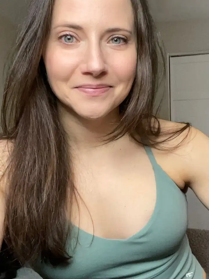
component · AvatarStack
Give every control a label. Put errors beside the field and preserve keyboard access.
component · Field · Input
component · Field error · Input aria-invalid
component · Label · Textarea
component · Field · Select
component · CheckboxField · Checkbox
Drop an image or browse
Disabled specimen. No files are uploaded.
component · ImageUploadField disabled
component · Dialog
Dark bands frame the story. The gradient carries the brand. Every number here is a specimen, not a platform fact.
Hero specimen
Real creator portraits and shared hero typography.
component · HeroBand
Compatibility export specimen.
component · GradientHero (compatibility alias of HeroBand)
component · GradientBrandBar
component · StatBar specimen
component · GhostWord
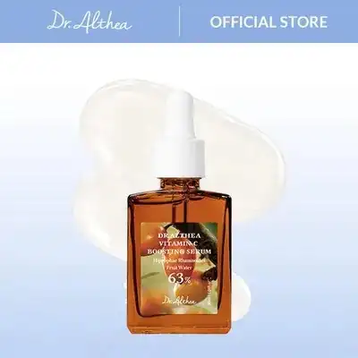
Dr.Althea
Funded
Budget committed
component · MarketingVignette kind="funded"
Balance
Released
RELEASED ON APPROVAL
component · MarketingVignette kind="wallet"
Brief
Approved
RELEASED ON APPROVAL
component · MarketingVignette kind="brief"
Give the work room to speak.
component · MediaRow · MediaThumb
component · StatementPanel
Make the first step clear.
Show the work.
component · ProcessRow
Footer band specimen
component · FooterBand
component · RatingSummary
Embassy Score specimen: excellent
How this brand treats creators, from Embassy data.
95 out of 100
ExcellentSpecimen only, not live brand data.
Based on 12 rated events.
component · EmbassyScoreBadge · EmbassyScorePanel band="excellent"
Embassy Score specimen: strong
How this brand treats creators, from Embassy data.
80 out of 100
StrongSpecimen only, not live brand data.
Based on 12 rated events.
component · EmbassyScoreBadge · EmbassyScorePanel band="strong"
Embassy Score specimen: fair
How this brand treats creators, from Embassy data.
60 out of 100
FairSpecimen only, not live brand data.
Based on 12 rated events.
component · EmbassyScoreBadge · EmbassyScorePanel band="fair"
Embassy Score specimen: low
How this brand treats creators, from Embassy data.
30 out of 100
Needs workSpecimen only, not live brand data.
Based on 12 rated events.
component · EmbassyScoreBadge · EmbassyScorePanel band="low"
Embassy Score specimen: new
How this brand treats creators, from Embassy data.
New brand
Not enough rated history yet.
Specimen only, not live brand data.
Based on 0 rated events.
component · EmbassyScoreBadge · EmbassyScorePanel band="new"
Night navigation, brand gradient heroes and emerald balances bring the signature language into the light app. Purple marks creator surfaces; gold stays earned.
Creator
component · AppChrome
Home hero specimen.
component · AppHeroHeading · StatBar hero specimen
Tinted icon chip specimen
component · IconChip · CardEyebrow
component · StatBar emerald balance specimen
Emerald confirmed, gold earned, amber decision, blue info, red negative, grey closed. Name the status as well as colouring it.
Status is always named in words as well as colour.
component · ChatCardView · chatCardChipStyle
Status is always named in words as well as colour.
component · SystemCardView
Respect prefers-reduced-motion. Marquees and reveals stop; counters show their final values.
Use the shared durations for feedback. Motion should support the next step without delaying it.